
Judging Books by Their Covers
- Nostalgic Reader

- Jan 23, 2023
- 10 min read
Updated: Jan 25, 2023
10 Favorite Book Covers: A Graphic Designer’s Perspective on the Importance of Cover Design
When selecting a new book to read, particularly one by an author I’ve never read, I ignore the old metaphor “don’t judge a book by its cover.” As a graphic designer, I am of the opinion a book's cover design is the vital element of selling the entire package. I disregard the glowing reviews and merely scan the back-cover blurb for keywords that capture my interest. I expect the cover to establish the story’s atmosphere. The success of the design factors into my decision to either pass on the book or give it a try. I doubt I'm unique in this process. When picking up new books to read by familiar or favorite authors, the cover design is much less important because I have already established an expectation of what I’m about to read. Upon finishing a book, the cover design bears no influence on my opinion of the content on the pages. However, like the words themselves, the cover can leave a memorable or unmemorable impression when considering the book in retrospect.
What makes a striking cover design? That can be subjective, of course. I have my own preferences and pet peeves. I am drawn to pattern, custom-lettered type designs, and unique use of space. I can also appreciate a historical painting incorporated into a cover, though it's hardly an original idea. The Barnes & Noble Classics series and the Oxford World’s Classics paperback collection make use of this design strategy, as well as several others. I often use famous paintings in my own songbook cover designs when appropriate, generally for classical music. Conversely, stock photography – specifically, images of women – is my greatest annoyance when it comes to book covers. The back view of a woman walking into the distance seems to be prevalent in historical fiction cover design. It doesn’t deter me from reading a book I otherwise believe I will enjoy, but it gives me the impression that the book’s goal is commercial marketability rather than literary merit. I admit that, out of necessity, I utilize stock photography in my own designs for my job, and my creative spirit dies a bit when I do.
Enough lamenting about bad design! The following list includes ten of my favorite covers among books I enjoyed reading and would recommend.

1 | Beasts of a Little Land Juhea Kim
Hardcover
DESIGN
This gorgeous, vibrant design pays homage to traditional Korean folk art featuring a painted screen with a mountain landscape and the culturally significant tiger (relevant to the novel in that one of the characters is a tiger hunter). I would have picked up this book for the subject matter alone, but the cover design is an additional treat. It set my expectations high as an epic historical tale of tragedy and perseverance.
REVIEW
This fictional book is profoundly devastating. Set during the turmoil and oppression of Japanese colonial rule from 1917 through WWII and the subsequent Korean War, I expected a heartbreaking story and anticipated a sad ending. Yet, I wasn’t fully prepared for how hard this book would hit me. The author delivers a raw, realistic narrative, weaving a tale of multiple characters’ journeys of hardship and survival, seeking love and a better life that is always just out of reach.
My Goodreads Rating: 5 Stars

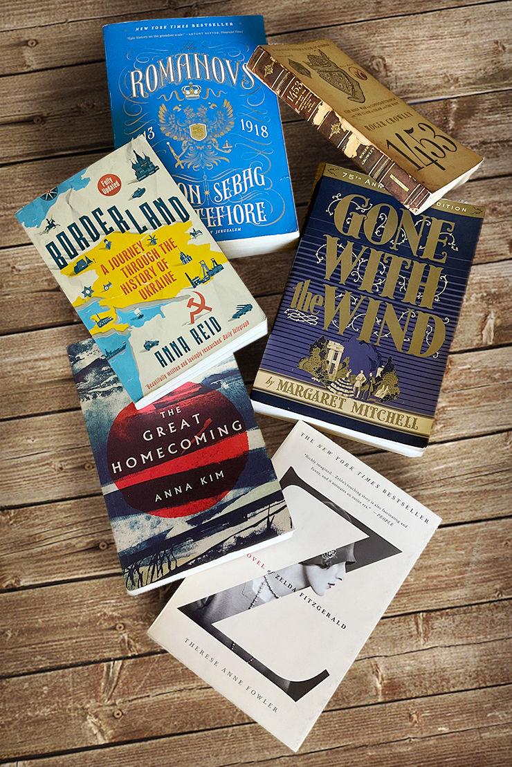
2 | Z: A Novel of Zelda Fitzgerald Therese Anne Fowler
Paperback
DESIGN
This is one of the most unique covers I’ve seen. I don’t know that I would have picked up this fictional novel about the wife of famous American author F. Scott Fitzgerald if the cover design hadn’t lured me in. The clever use of cropping and the strong diagonal created by the large letter Z draws the eye and expresses the ingenuity of the subject of the novel, Zelda herself. A rare exception to my aversion to stock photos of women.
Note: A similar design is applied to another Fowler novel, titled A Well-Behaved Woman: A Novel of the Vanderbilts.
REVIEW
The novel is worthy of this sleek design. The author presents a sympathetic exploration of the trials Zelda faced as an aspiring writer stifled by the fame of her husband, facing health issues, suppression of autonomy, and denial of credit for her writing. Zelda is often considered to be responsible for the ruin of her husband Scott’s career. Perhaps they were each other’s downfall. Whatever the truth, the author presents Zelda as her own person, a woman with hopes and dreams and flaws, rather than merely the instrument of a famous author’s demise.
My Goodreads Rating: 4 Stars

3 | Gone with the Wind Margaret Mitchell
75th Anniversary Edition, paperback
DESIGN
This cover features a beautiful Tuscan lettering type design and a small figure illustration reminiscent of 19th-century woodcut prints. I already owned two copies of this novel when I happened to see this edition at Half Price Books. I couldn’t resist this elegant cover and added a third edition to my collection.
REVIEW
This sweeping literary saga of anti-heroine Scarlett O’Hara set during the Civil War and the end of the Antebellum South through Reconstruction still holds up as a great American classic, in my opinion. Written nearly one hundred years ago, some elements of this novel are problematic and no longer politically correct, but if you can look past them and view this work as a product of its time, there is much to enjoy about this story. While critics may characterize Scarlett as a conniving temptress devoid of morals, I appreciate her tenacity in a time of war and destruction. She is a survivor who utilizes her feminine wiles and her brain (Scarlett is described as having a good head for business and the ability to calculate sums quickly in her head) to ensure that she and her family will never go hungry. She is willing to overlook sentimentality and ethics to get done what needs to get done. If she were a man, she would be lauded for her accomplishments rather than disparaged because the same traits are unseemly in a woman. Scarlett O’Hara is a person you want on your side in times of trouble, which her saintly sister-in-law and rival in love, Melanie, acknowledges and appreciates.
One of the themes in the novel which is not fully conveyed in the 1939 Academy Award®-winning film is the significance of land ownership. Scarlett’s father takes great pride in the plantation – named Tara after the seat of the High Kings of Ireland from the Neolithic to the Iron Age – he won in a poker game and has cultivated over the years. He tries to instill the same love for the land in his daughter. Gerald O’Hara is an Irish immigrant who left his home country during a time when laws forbade the native Irish from owning land. Though Scarlett initially hates Tara and wants nothing to do with it, her father’s words about the importance of holding on to the land eventually resonate with her as she makes sacrifices and starts a business venture to keep the plantation running during the Reconstruction period.
My Goodreads Rating: 5 Stars

4 | The Great Homecoming Anna Kim
Paperback
DESIGN
I ordered this book based on a recommendation, uninfluenced by the cover design. I was pleasantly surprised and further excited to dive into the story upon seeing the beautifully ominous cover. More details emerge the longer I analyze the design. From the predominant red sun, a symbol of Japanese imperial aggression, to the silhouette of a barge on the sea and crashing waves, the ink-washed images immerse me in the broken and convoluted world of mid-20th century Korea.
REVIEW
Anna Kim’s fictional novel focuses on a group of Koreans’ lives from the 1940s through the aftermath of the Korean War. They eventually emigrate to Japan following the chaos and divisions of the civil war. They are enticed to return to North Korea as a part of the Great Homecoming repatriation movement, with offers of good jobs, food, and housing. The author provides lengthy historical detail, shedding light onto the complex political situation on the Korean Peninsula during the mid-1900s. Everything in this novel is painted in shades of gray. The author skillfully set up scenarios which left me feeling as though I clearly understood good from bad only to turn a situation on its head, causing me to re-assess what I just learned.
My Goodreads Rating: 5 Stars

5 | The Romanovs: 1613–1918 Simon Sebag Montfiore
Paperback
DESIGN
A beautifully embossed type design featuring golden filigree and the imperial double-headed eagle, worthy of the Russian royal family.
REVIEW
This nonfictional tome is a comprehensive account of the 300-year reign of Romanov tsars beginning with the teenage Tsar Michael I and ending with the ill-fated Tsar Nicholas II. Each chapter reads like a mini biography of each ruler. More attention is given to the later tsars, as there is a greater wealth of information about them available. Though I would have preferred fewer details of medieval torture and the tsars’ intimate lives, overall, this is an engrossing account of the lives of the Romanov dynasty.
My Goodreads Rating: 4 stars

6 | Borderland: A Journey Through the History of Ukraine Anna Reid
Paperback, Fully Updated Edition
DESIGN
The clever typographical treatment and iconographical cover illustration present a creatively rendered map of the subject country. Updated to include Putin’s annexation of Crimea in 2014, no doubt the recent 2022 invasion of Ukraine will warrant a new edition in the future.
REVIEW
Part travelogue, part history lesson, journalist Anna Reid takes her readers on a fascinating journey through over one thousand years of Ukrainian history, organized by region. She recounts many of her conversations and interactions with residents of various geographic locations during her time as the Kiev correspondent for the Economist and Daily Telegraph between 1993–1995. This is not just another dry history book. It is a look into the soul of the ofttimes cynical yet resilient Ukrainian people.
My Goodreads Rating: 4 Stars

7 | Mary Queen of Scots Antonia Fraser
40th Anniversary Edition, paperback
DESIGN
This edition sports a charming type-treatment cover styled to look like needlepoint, reminiscent of tapestries hung in medieval castles.
Note: I recently saw a different biography of Mary Queen of Scots by another author which features the movie tie-in art from the 2018 film. I will forever despise film posters being used on book covers, and this seems like even more of an affront. The film is hardly historically accurate, and the image misleads the reader as to the nature of the book, which I assume is intended to be a scholarly biography, not a work of fiction.
REVIEW
This meticulous work of nonfiction is the definitive biography of the tragic Scottish queen. The author is sympathetic to Mary, crowned queen when she was six days old, who finds herself in an impossible situation of holding onto a tenuous Scottish throne amid political and religious upheaval. She is raised in Catholic France, returning to a newly Protestant Scotland after her husband, the King of France, dies young. While Mary decides to marry a man in line to the British throne and produce an heir, her cousin Queen Elizabeth I chooses to maintain power by remaining unwed and childless. Ultimately, Mary and Elizabeth’s calculated risks to secure the futures of their reign decide their fate in this real-life, female dominant Game of Thrones. Though dense at times, the author leaves no detail uncovered, making this a worthwhile read for anyone interested in the controversial 16th-century queen.
My Goodreads Rating: 4 Stars

8 | The Silence of Bones June Hur
Hardcover
DESIGN
Dark and haunting, this gorgeous image-within-an-image illustration showcasing Korean ink brush painting sets the mood for the YA historical Joseon-era mystery.
REVIEW
This novel was my first true foray into Asian history. After watching several Korean dramas (known as K-dramas), my interest in Korean history and culture was awakened. I looked up any book related to Korean history that was available at my public library; this was the first result that grabbed my attention. The Silence of Bones plunged me headlong into an ongoing odyssey that has been over two years and more than 50 books in the making.
The story is set in the year prior to the Catholic Persecution of 1801 in Korea, then known as Joseon. Though classified as young adult, featuring a teenage female protagonist, this felt like an adult-level novel. The story is intense and bloody without being disturbingly graphic. The author does not shy away from the realities of an era which was often cruel to women. The protagonist, a police tea servant known as a damo, is requested to inspect the slain corpse of an upper-class woman since men are not allowed to physically touch women of noble birth. Thus ensues a murder mystery with ties to the Catholic persecution looming on the horizon. I couldn’t put this book down; I read it in two sittings. The rich details of Korean history and culture, the haunting atmosphere, and the unexpected twists in the narrative left me eager for more.
My Goodreads Rating: 5 stars

9 | Peach Blossom Spring Melissa Fu
Hardcover
DESIGN
This cover is a perfect blend of Asian pattern and stylized Chinese ink brush painting catered to my personal taste. The enclosure of various elements in overlapping circles tie together to form a cohesive design that tells a story in of itself, much like the Peach Blossom Spring narrative scroll featured in the novel.
REVIEW
The book is as memorable as the cover. I voted for Peach Blossom Spring in the Goodreads Choice Awards for Historical Fiction Book of the Year in 2022. Sadly, it did not win, but I was delighted to see it gain so much recognition as one of the nominees. This tale of a mother and son’s journey across war-torn China during the Japanese invasion of 1937 throughout WWII, their escape to Taiwan after the Communist takeover in 1949, and the son’s complicated immigration to the United States in the late 20th century is semi-biographical. The author relates many details of her father’s own experiences as a refugee in Taiwan and an immigrant in the U.S. in a heart-rending, fictionalized narrative of tragedy, hope, and reconciliation.
My Goodreads Rating: 5 Stars

10 | The Mystery of Mrs. Christie Marie Benedict
Hardcover
DESIGN
This intriguing cover features a leaf pattern obscuring the eyes, and therefore the identity, of a woman in profile. The design choice is as mysterious yet intriguing as the infamous disappearance of the Queen of Crime on which the novel is based. I don’t recall the leaves having any significance to the story, but if I’m wrong, then all the better. I am an artist who designs with intention. I appreciate when there is an intellectual meaning behind design choices in addition to visual aesthetics. Is there one in this instance? I have no idea, but I do find the cover visually attractive.
REVIEW
A fictional retelling of the 11-day disappearance of the famous detective novelist in 1926, the storyline alternates between Agatha Christie’s “present-day” disappearance and 14 years prior when she first meets her husband. Eventually, the two timelines converge, and the reader comes to understand why the mystery writer chose to disappear and claimed to have amnesia when she resurfaced. Despite being somewhat familiar with Agatha Christie’s infamous disappearance, author Marie Benedict’s cleverly constructed tale read like a thriller and kept me turning the next page to find out how the intricate web of events would be untangled.
My Goodreads Rating: 4 stars

HONORABLE MENTION
1453: The Holy War for Constantinople and the Clash of Islam and the West Roger Crowley
Paperback
The most compelling part of the cover design is the spine. It truly looks like a worn, ancient leather-bound book that has been slowly deteriorating since the 15th century. I applaud the designer’s commitment to the overall treatment of the cover.
Currently Reading


Comments